By Chris Evans, Founder & Principal at Drumminhands Design, an interactive media and graphic design studio committed to audience, interpretation, and accessibility. With over 16 years of industry experience, Chris is excited to share some tips and tricks on how to improve the accessibility of your exhibits.
Why should exhibits be accessible?
There’s a few really good reasons. Let’s get the scariest one out of the way: the rule of law. All visitors have a right, regardless of ability, to enter and reach and experience an exhibit. In some cases, institutions have faced legal consequences for failing to provide adequate visitor accessibility. Here are some case law examples:
- United States v. International Spy Museum (2004)
- Department of Justice v. Crime Museum (2015)
- Grey v. Golden Gate National Recreation Area (2008)
But beyond the threat of a lawsuit? Accessibility is about empowerment. To create a space where visitors can share the totality of an experience together. Where no one is left on the sideline, filling in the gaps with their imagination.
Most importantly: empowerment makes way for knowledge. Accessible exhibits get your interpretive messages across to more people. And when it boils down to it, isn’t that what we’re here to do?
Assemble the Team
At the beginning of the project, make sure you have diverse team members. Do any of your team members have lived experience with a disability? If not, add some as soon as possible. You could find more colleagues, hire a subconsultant, or budget for regular planning/prototype sessions with a disability focus group. It is crucial for your team, and the experiences you create, to learn from their perspectives.
“An accessibility team with no disabled members is a tragedy waiting to happen… Disability is not homogenous, and what works with one person might not work for someone else. So it is essential to engage as many individuals across the spectrum of disabilities as you can.”
—Darren Bates, Global Accessibility & Disability Inclusion Strategist
Plan for Accessibility from the Beginning
Adding accessible moments late in the design stage is a recipe for disaster. Plan for accessibility at the very beginning. Make accessibility a principle of your project. Put accessibility in your budget from the start and protect it. Far too often, accessibility is cut when budgets get tight. Don’t do it.
Design for visitors with Low- or No-Vision
Exhibit design is often incredibly visual. How do you provide access to those visitors who may not be able to see it? Two techniques pull the most weight: Audio description and tactile elements.

Audio Description
This tool is a descriptive narration of key visual elements in the visitor experience. Audio description is not the same as a narrated tour. Audio description should describe physical attributes, motion, interpretive text, etc. Try turning on audio description the next time you watch Netflix to get a sense of the experience.
Consider hiring experts to write your audio description scripts, as this is a very precise skill. Not just any writer can write a proper audio description. It’s helpful to record two voices in each description—one who reads any printed interpretive text and a second for the description of physical space. Try to get each track under 2 minutes but absolutely no longer than 5 minutes. When planning, you may need to break up your audio description content into more stops to get the length of each track down accordingly.
Once you have your tracks recorded and edited, you’ll need to deploy the tracks for the visitors to use.
There are two excellent approaches available: integrated vs. handheld audio players.
- Integrated players allow visitors to press a button or lift a handset to listen to the audio description while exploring your exhibit. Be sure to include a printed and Braille label so visitors know what to expect before they trigger the audio.
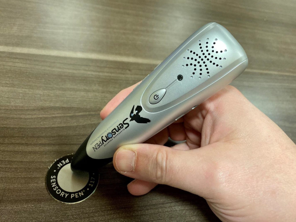
- Alternatively, consider having loaner handheld devices at the front desk. Visitors need to know when and where to trigger audio content on their handheld device. A simple label with Braille corresponding to a track number is sufficient. Geo-triggers are even more precise: when visitors are outdoors, they can use their handheld devices to auto trigger content. RFID triggers or optical scanners can also be placed at specific locations in an interior exhibit.
Make it easy for visitors to know they are in the right place for audio description content. Design a physically-raised shape so someone can feel where the trigger is. Build a system where the flooring changes from carpet to a hard surface circle, so the visitor can find the trigger within reach. Put the triggers at consistent locations, such as the bottom right-hand corner of each panel. If you build a wayfinding rhythm into your exhibit system, visitors will learn it and search for it.

Tactile Elements
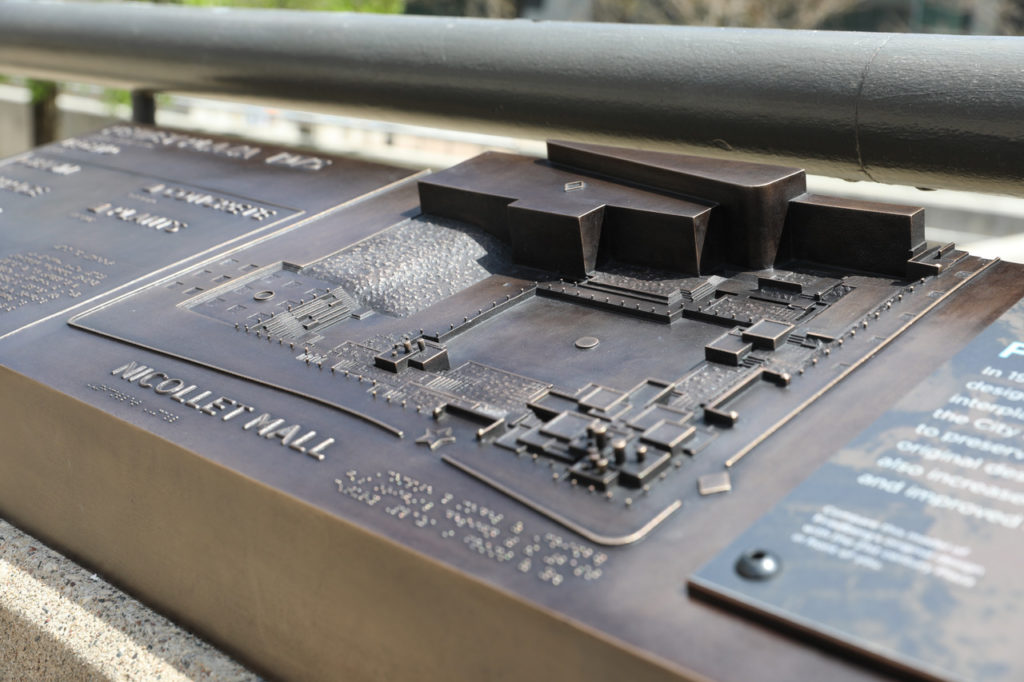
Tactile elements in your exhibit provide objects that visitors can touch to better understand your interpretive messaging. For example, imagine the textural differences of bark–smooth, bumpy, rough, jagged–for two different tree species. You might be able to sense a difference, but so what? Feeling an object without interpretive messaging is an empty experience.
Provide context.
Include raised letters to label items, but they are typically about providing information rather than interpretation (i.e., “bark”). This is because raised letters take up a lot of space. Be sure to include a Braille translation of the label, too. And hire an expert to translate the Braille. Even better, on a graphic panel nearby have a printed caption and a Braille version of the caption in the tactile element. Alternatively, use raised letter labels in the tactile element and accompany the experience with audio description. This last approach often gives the best visitor experience, as audio description can be much longer than a Braille caption.
Begin the tactile exhibit process with a sketch.
Be sure to include room for raised letters and Braille. Next, hire a modeler who works in clay or digital 3D. For the clay modeler, provide an acrylic base with raised letters and Braille from a standard architectural signage company. The digital 3D artist will need to 3D print a model. With a physical model, the fabricator can mold and cast the tactile element.
For the final piece, epoxy-based materials are acceptable, but they need to be replaced every few years. By the time you re-cast the epoxy-based tactile element two or three times, you have paid for the cost of a single bronze tactile. Though more expensive, bronze will last a lifetime.
Design for visitors with sensitivity to light and sound
Have an exhibit full of media pieces producing light and sound pollution? Include hidden switches that allow your staff to turn on or off the offending media as needed. Sometimes turning off the amplifier is enough. Also, plan regularly-scheduled special access events where people can self-select to visit the museum at a time with smaller crowds and with less stimuli. Make your visitors feel valued.
Make a touch screen more accessible
Do you have a touch screen experience and all of the user interface items are built into the screen? How does someone with low or no vision use the device? Instead, try to break out of the screen model with alternate interface items. Choose a few from below:
- Pair the touch screen with arcade buttons including Braille labels.
- Use capacitive touch sensors on uniquely shaped touchable targets—choose the shapes based on your interpretive content, such as outlines of different animals.
- Create a more accessible version of the experience triggered by the press of an arcade button. Label the button in print and Braille so visitors know this alternate experience exists. Then use the touch screen as a giant trackpad. Use swiping gestures. Or divide the touch screen into two large touch areas: left and right. On reset, visitors using sighted guides navigate your touch screen as normal until the arcade button is pressed again.
- Add narration to the experience, guiding the visitor.
However you choose to make your touch screens, give the visitors agency to make their own choices.
Try for Universal Design over Accessible Design
The above examples showcase accessible design but not universal design. Americans with Disabilities Act (ADA) and the Architectural Barriers Act (ABA) laws often lead to alternative methods to those with specific disability needs alongside options designed for so-called “everyone else.” Try to be more universal instead.
“Universal Design is accessible to all people, to the greatest extent possible, without the need for adaptation or specialized design.”
–Scott Pruett, The Universal Design Project
Adding universal design elements makes the experience better for everyone.
Curb cuts make it easier for everyone entering the street. Door handles with horizontal latches instead of a sphere handle are easier for everyone to operate. Same with raised letters in restroom signs. Braille, however, is only easier for those who read Braille. Still add Braille. But just know that it’s not a universal design approach.
When you’re designing a specific experience, ask yourself some questions. Can we make this easier for your grandmother or a parent holding a toddler? Can we add a soundscape experience that adjusts in-time with the visuals? Does this experience need audio description, or can we tweak the experience so everyone can participate in the same moment?
Overwhelmed? Know you’re heading in the right direction.
Accessibility is integral to successful exhibits, but it doesn’t happen overnight. Pick one project and add one accessible approach. Then keep growing and make this a regular element in your process. You can do this. Your visitors will thank you.
Related Resources:
- Smithsonian Guidelines for Accessible Exhibition Design
- 7 Principles for Universal Design
- How to Procure Digital Services with Accessibility in Mind by Sina Bahram
- Dos and Don’ts on Designing for Accessibility
- U.S. Access Board
- Quick Reference Guide to ADA Signage
- Captioning Key
- Disability Advocacy Rights
- Web Section 508
- #a11y on Twitter
*Note, some of the photos provided are from projects when Chris Evans was an employee at 106 Group, prior to launching Drumminhands Design.
